
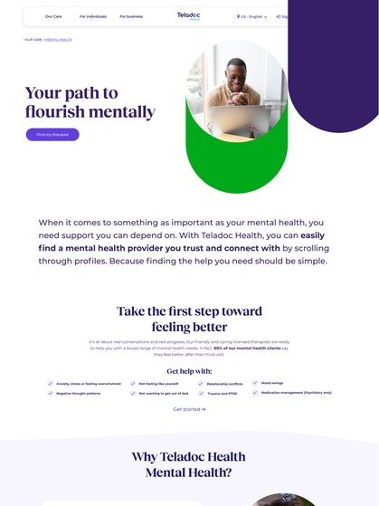
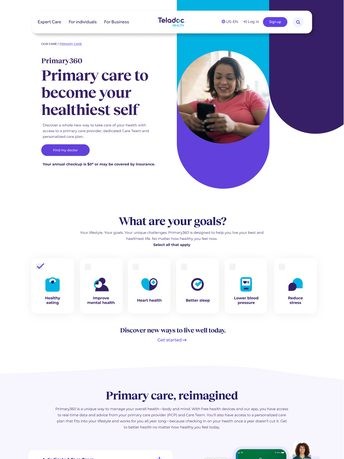
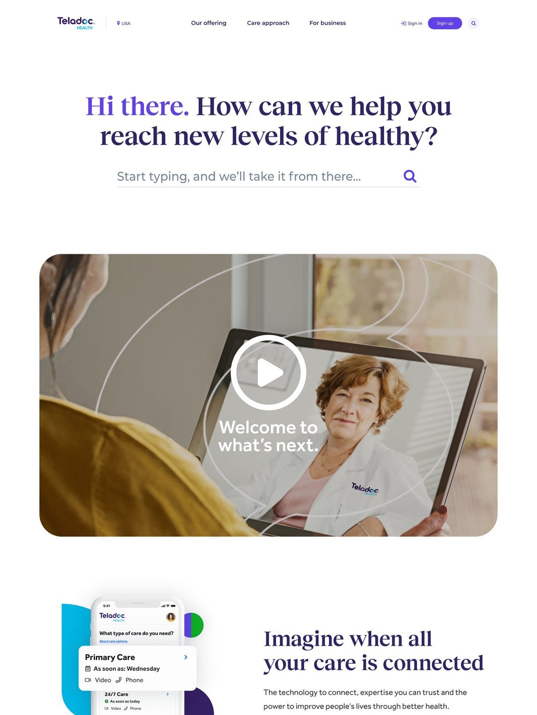
A corporate re-brand that consolidated two fragmented legacy identities — one consumer, one B2B — into a single brand. I brought the work in-house after the outside agency fell over budget and behind schedule, then shaped it hands-on into something with real purpose: colorful, overlapping shapes that signify people's health information and the uniqueness of each person's life, built around the line "Care for what's next."
Teladoc Health was operating with two distinct visual identities — one for consumer audiences, one for B2B — the legacy of a company that had grown fast through acquisition. That split was creating a fragmented brand story at exactly the moment the business needed a single, confident identity people could recognize anywhere.
Superunion did the initial branding work, but the engagement ran over budget and behind schedule, so we brought it in-house. I took it the rest of the way hands-on — modifying the direction into something the CMO stood behind, and giving the colorful, overlapping shapes an actual rationale instead of decoration: they signify people's health information and the uniqueness of each person's life, with Teladoc Health positioned to propel people forward into whatever's next — "Care for what's next." The taglines and copy system were my team's, and the design system that carried this identity into the product itself — color, type, components, the whole library — was also my team's work, directed by me and executed by Liz Stynchcomb.
Design credits: Liz Stynchcomb (design system execution), Piper Gleadhill (top designer on Teladoc brand work).
The rebrand achieved the key objective it was built for: repositioning Teladoc from a simple telehealth company into a whole-person virtual care company. On the consumer side, the new identity drove awareness of the full breadth of care options now offered. On the B2B side, it drove awareness with employers, health plans, hospitals, and health systems of the company's scale, offering, and differentiation versus competitors.
fragmented legacy identities consolidated into one confident brand
repositioning delivered across both consumer and enterprise audiences
unified design system, built with real meaning behind it, rolled out org-wide
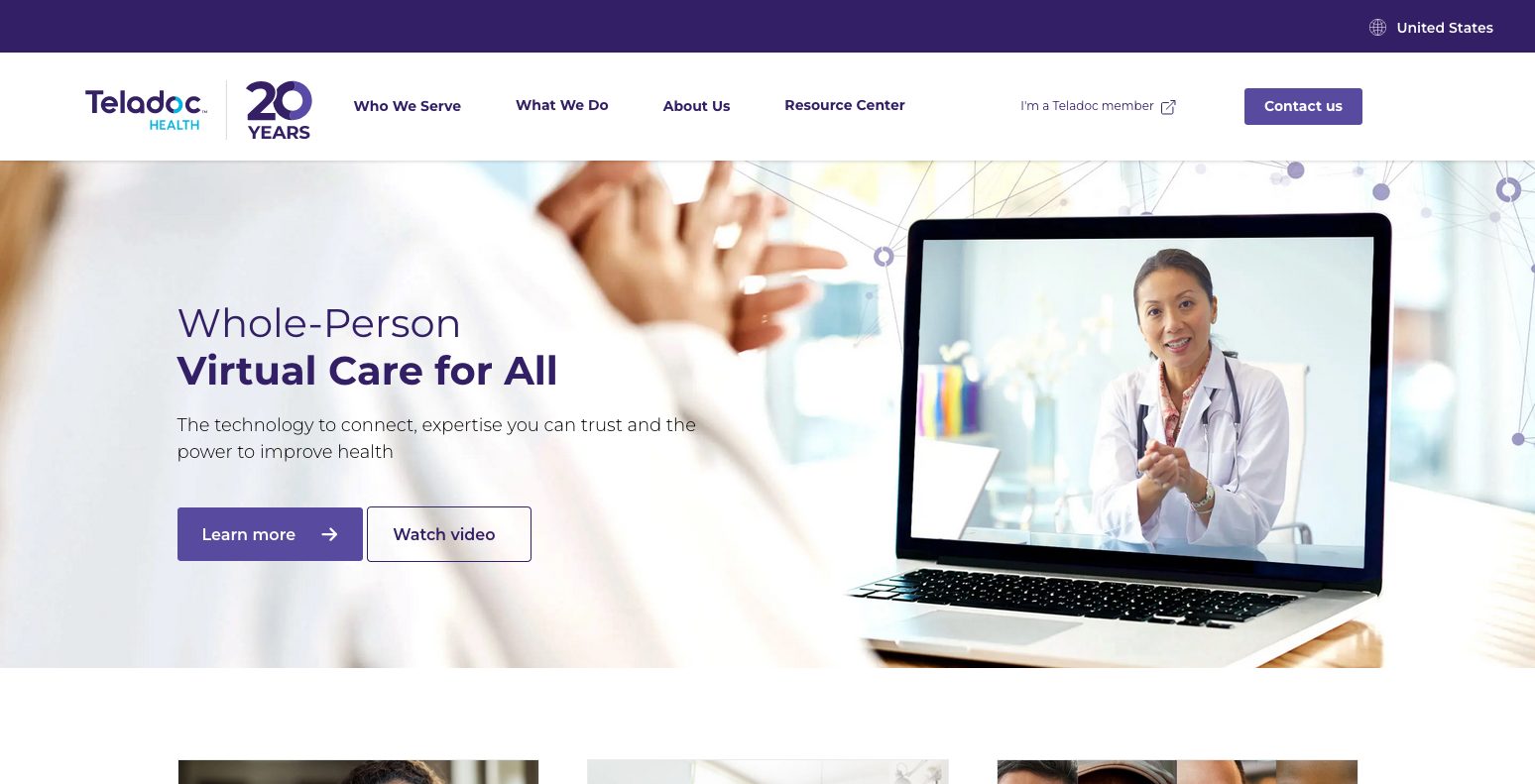
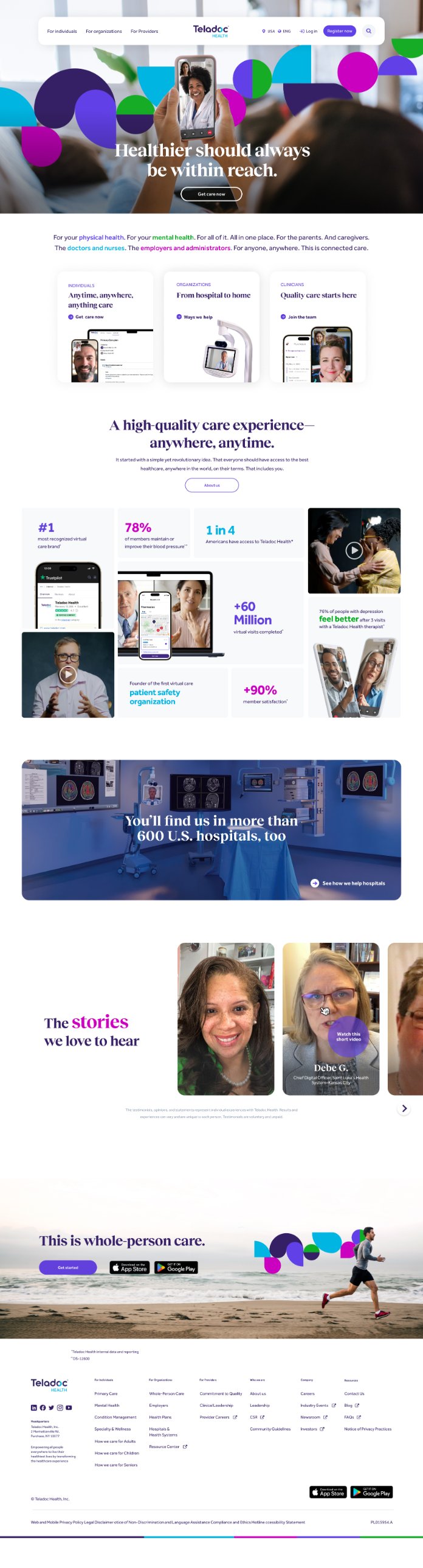
The consolidated brand, before & after
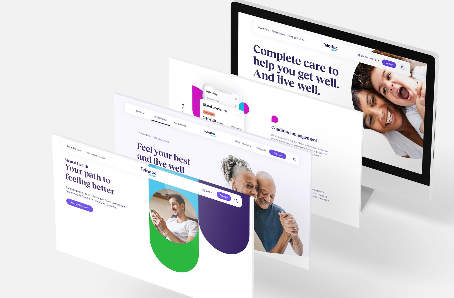
Identity exploration & system work
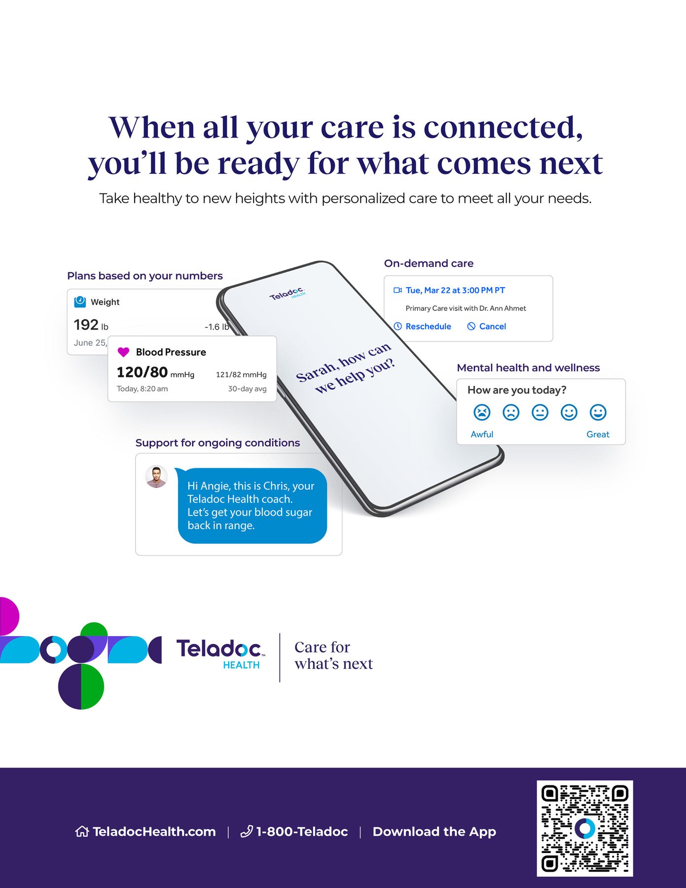
![“[Name], welcome to what's next” — personalized notification concept](../images/work/corporate-rebrand/process-2.jpg)

This page covers the brand itself — the strategy and the "why" behind it. For how that identity actually got built into the site — the AEM platform migration, the design system, and the component library in detail — see the companion page: Teladoc Health — Site Strategy, AEM Migration & Design System →