← Back to work Case Study — Teladoc Health

Bringing it all together: one site, one system, hundreds of pages

Nearly a decade owning site planning, content strategy, and web execution for the leader in virtual care — bringing Teladoc's separate consumer and B2B properties together, folding in the Livongo merger, and migrating hundreds of disparate legacy pages onto a single AEM platform and design system built to carry all of it. See the brand & rebrand story → for the identity side of this work.
Client

Teladoc Health (incl. Livongo)

Role

Creative Director, 2015–2024

Type

Site strategy, AEM migration, design system, member product

Scale

~10M visitors a year

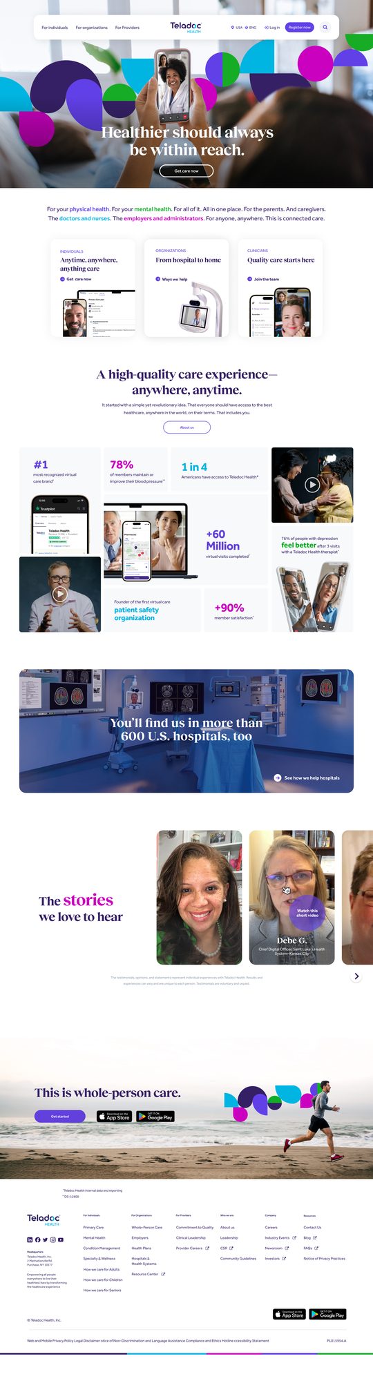
The new teladochealth.com homepage, bringing the consolidated brand and design system to the flagship consumer site
01 — Problem

Two separate web properties, then a major merger, then hundreds of disparate pages to bring under one roof.

As Creative Director from 2015 to 2024, I oversaw all web creative and development for Teladoc Health through startup, IPO, COVID, multiple acquisitions, and a major merger. For most of that run, Teladoc's consumer (B2C) and enterprise (B2B) web properties had grown up separately — different teams, different visual languages, different platforms. Then the Livongo merger landed a third large, fully-built site on top of that, with its own brand, its own UX conventions, and its own legacy codebase. The job was to bring all of it — hundreds of disparate pages across three properties — under one coherent experience, on one platform, without losing the momentum any of them already had.

02 — Strategy

Built it by hand first, then built the platform, the system, and the testing discipline to scale it.

When Teladoc was still a small startup, I personally designed and coded the entire teladoc.com site — messaging, look and feel, and the underlying tech stack — for what became a consumer property seeing roughly 8 million visitors a year. As the company scaled through IPO and acquisition, the priority shifted from building one site well to bringing many sites together: migrating the full B2C and B2B footprint onto a single AEM platform, then absorbing Livongo's site into that same system once the merger closed, modernizing its dated UX and brand position in the process rather than leaving it to run as a bolt-on.

  • Owned the consolidation of Teladoc's B2C and B2B web properties onto a single AEM platform, replacing years of fragmented, independently-built pages with one managed system
  • Led the Livongo.com integration after the merger — refreshing a dated, independently-run site's UX/UI and brand position and folding it into the same platform and design language
  • Directed the design system and component library that made a migration at this scale possible: color, typography, iconography, grid, spacing, and interaction states built to work across hundreds of disparate legacy pages, not just a handful of flagship templates
  • Designed and coded a B2B thought-leadership site on AEM, and a Medicare landing experience with a dedicated responsive design pass for desktop and mobile
  • Built out a video/motion graphics team in Argentina to extend in-house capability, and stood up an A/B testing and optimization workflow from scratch, running continuous tests across CTAs, landing pages, and flows rather than shipping once and walking away

teladochealth.com — the consolidated brand, live
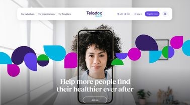
Providers / clinicians recruiting page, above the fold
Providers page — the clinicians-recruiting hero
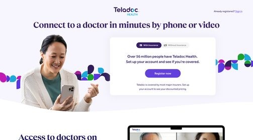
Connect to a doctor in minutes — conversion landing page, above the fold
"Connect to a doctor in minutes" — a conversion/paid-media landing page I created, purpose-built for a single action

Bringing Livongo into the fold

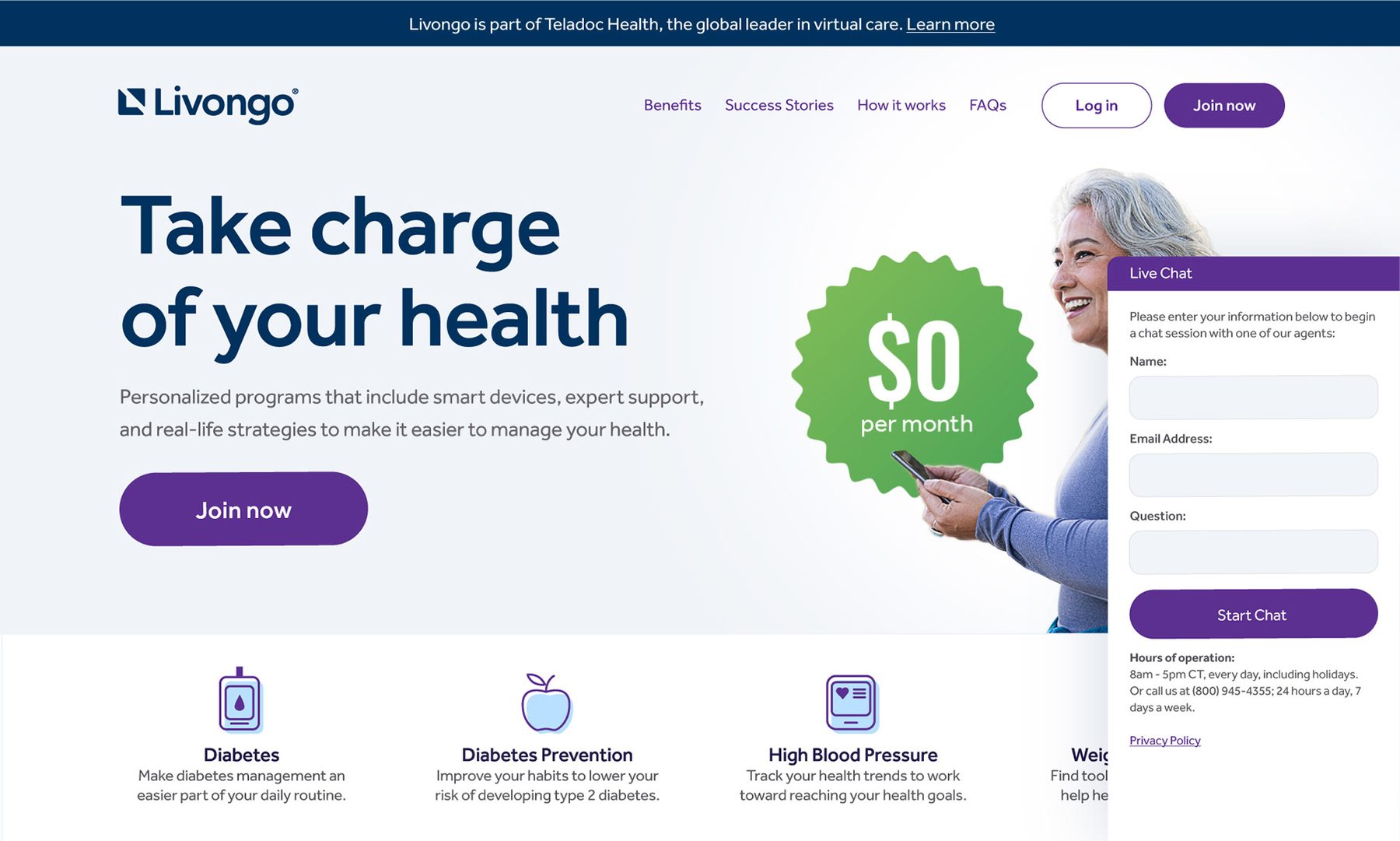
Livongo came with its own site, its own brand, and its own UX conventions — all of it built independently, pre-merger. Rather than leave it running as a separate island, I led the work to modernize it and bring it inside the consolidated brand and platform, the same way the B2B and B2C properties had already come together.
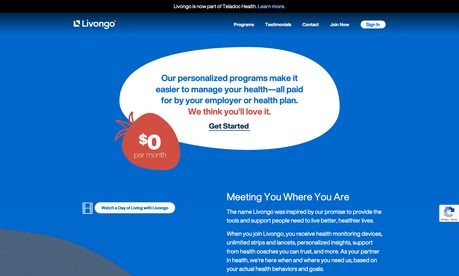
Livongo.com — before: the legacy site inherited via acquisition, above the fold
Before — the legacy, independently-run Livongo.com
Livongo.com — after: refreshed and brought into the consolidated brand and platform
After — refreshed, desktop
Livongo.com — after, mobile reflow of the hero and offer
After — mobile, reflowed to a single column
03 — Impact

Three properties, one platform — and a ~50% lift in click-through from one testing insight.

TeladocHealth.com now carries the full, consolidated B2C, B2B, and Livongo footprint on a single AEM platform and design system, seeing roughly 10 million visitors a year, with a meaningful share of new registrations attributable directly to this work. One example: a mental-health quiz I designed and built to capture users who weren't ready to register outright, surfacing proof points and trust indicators throughout the flow instead of asking for an account up front. The testing program also found that a "Find my therapist" call-to-action outperformed a generic "Register now" button by almost 50% in click-through — one of the largest single lifts the team found.

3 → 1

separate properties — B2C, B2B, and Livongo — consolidated onto one AEM platform

~50%

CTR lift from one A/B test: “Find my therapist” vs. “Register now”

~10M

annual visitors across the consolidated site

Medicare landing experience
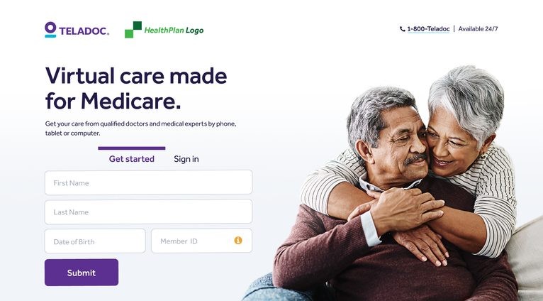
Medicare landing page, desktop — hero and enrollment form
Medicare landing page — desktop
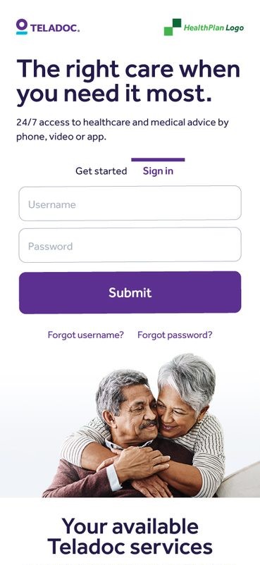
Medicare landing page, mobile — sign-in and hero
Mobile

Key pages across the consolidated site
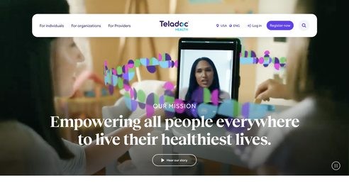
Mission page, consolidated brand, above the fold
Mission page
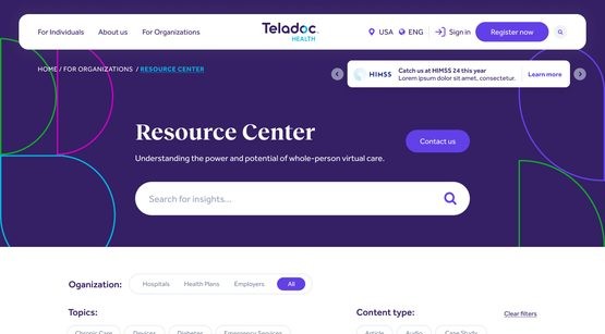
B2B Resource Center — AEM-powered blog and thought-leadership hub, above the fold
B2B Resource Center — an AEM-powered blog and thought-leadership hub built to bring hundreds of disparate articles under one template
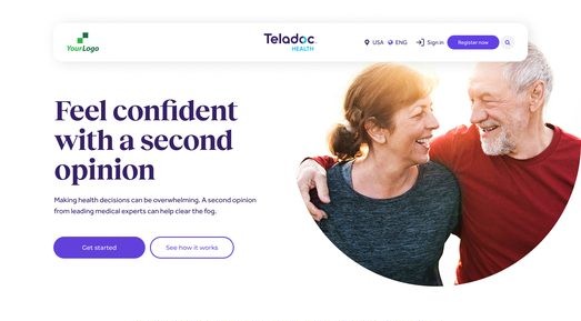
White-labeled partner template, above the fold
Partner template — a white-labeled page re-skinned for each health-plan and employer partner
Design System & Component Library

A design system built with intent, not just a style guide.

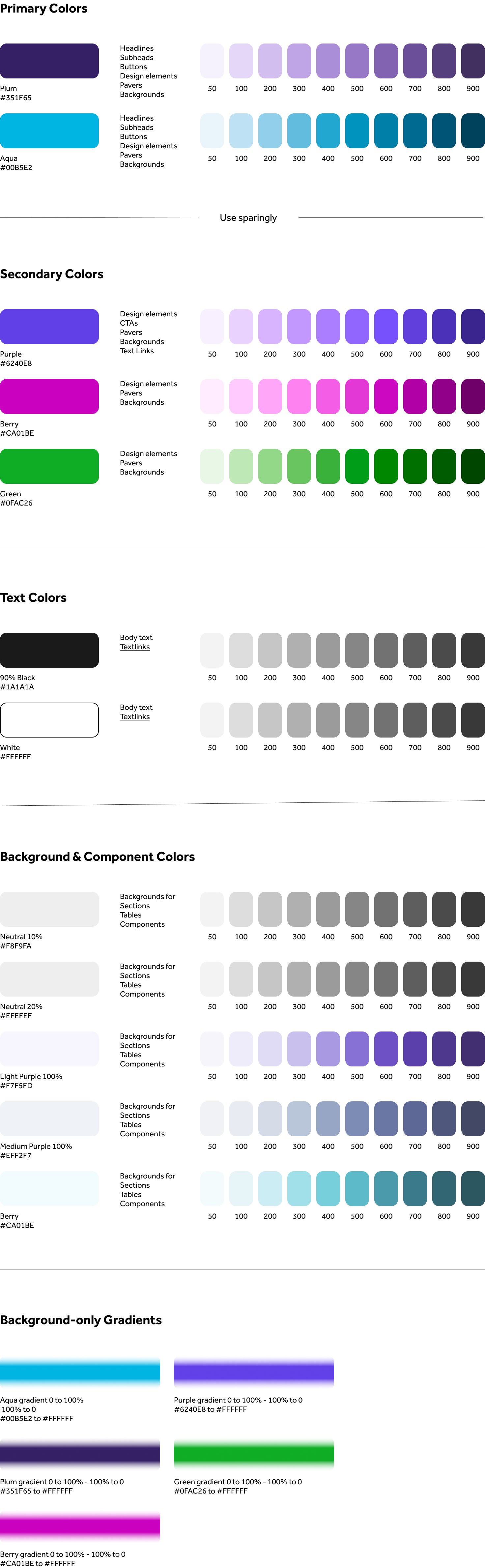
This is what made the migration actually possible at this scale: a design system and component library built to carry the consolidated brand across hundreds of disparate pages from three different properties, instead of a handful of hand-built flagship templates — color, typography (Reckless Neue for headers, Effra for body), iconography, grid, spacing, radius, shadow, and interaction-state specs, plus the component library itself. Liz Stynchcomb executed the system under my direction; I set the standards and signed off on every piece before the dev agency coded it into AEM components.
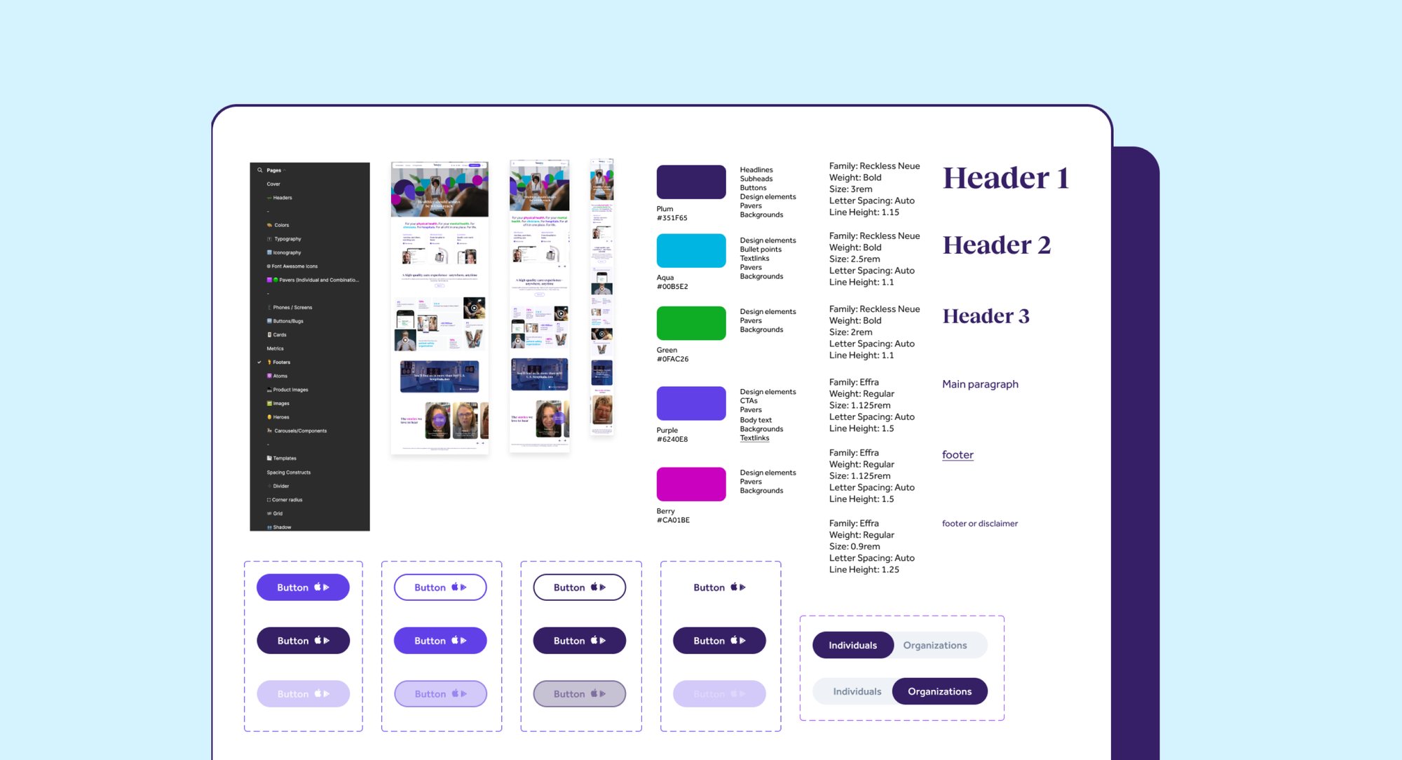
Design system cover and overview spread, showing the live site at desktop, tablet and mobile sizes
Design system — cover & overview spread
Full design system color palette — primary, secondary, text, background and gradient tokens
Full color system — primary, secondary, text, background & gradient tokens
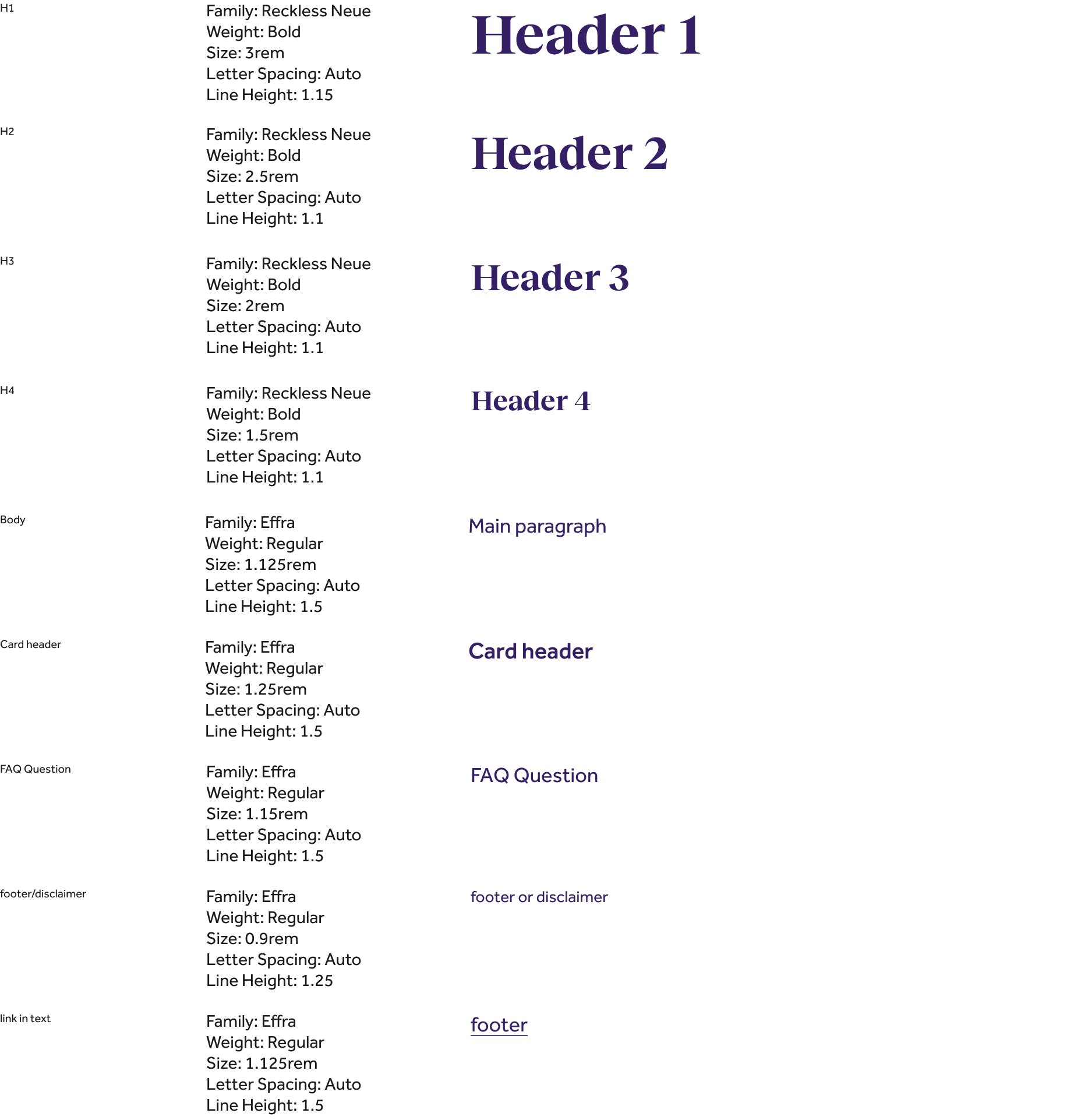
Typography specs — Reckless Neue for headers, Effra for body copy
Typography specs — Reckless Neue headers, Effra body
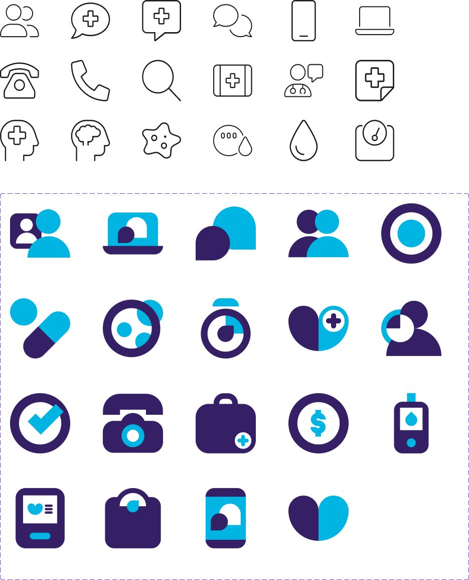
Iconography — outlined and duotone icon sets
Iconography — outlined & duotone icon sets
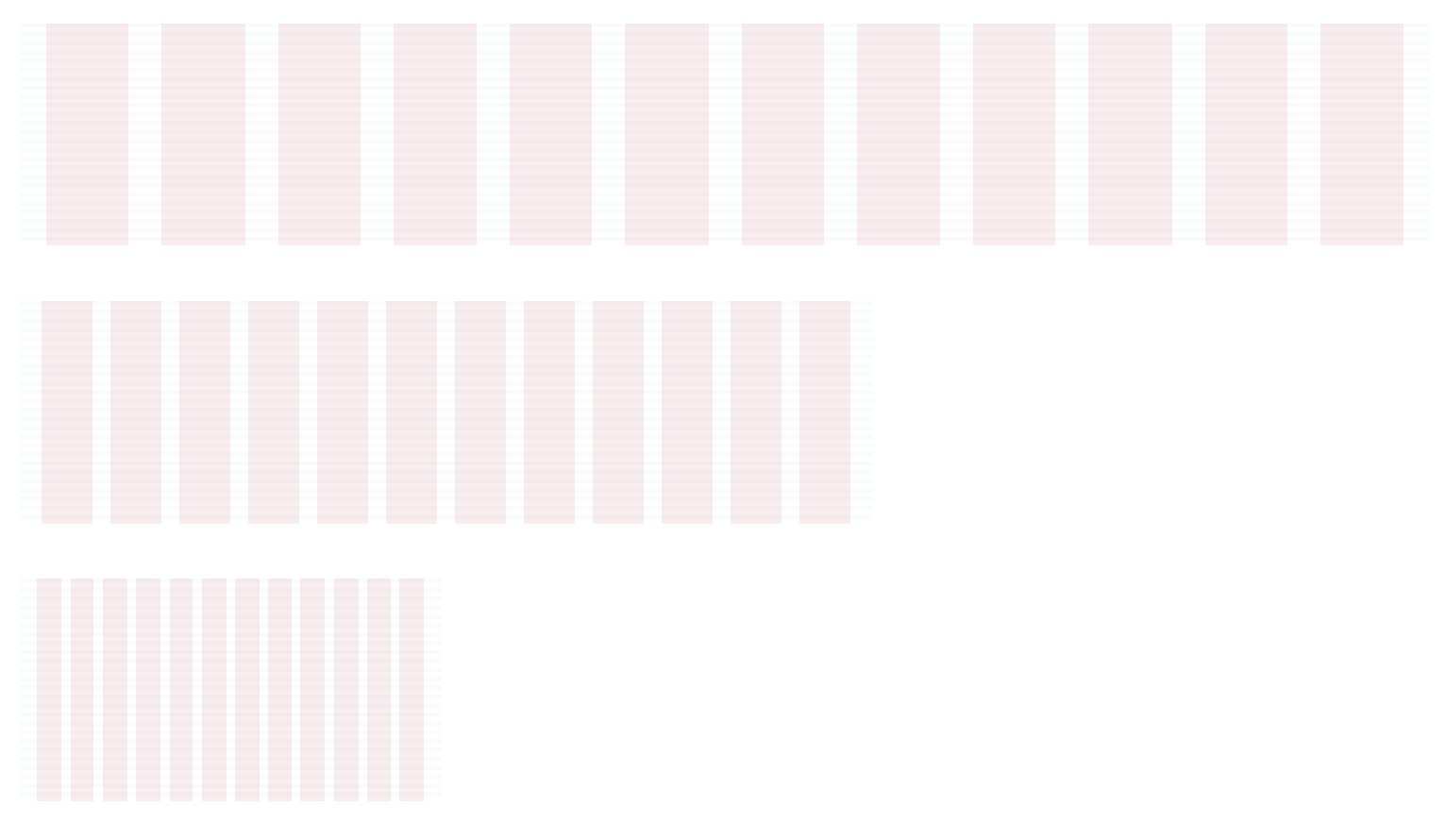
Grid specs
Grid specs
Component library, page one — feature tiles and phone mockups
Component library, page one — feature tiles & phone mockups
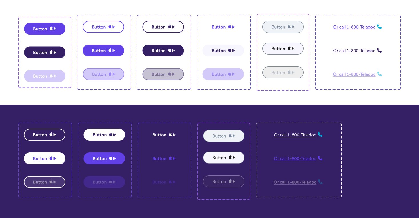
Button and link interaction states, light and dark backgrounds
Button & link interaction states, light and dark
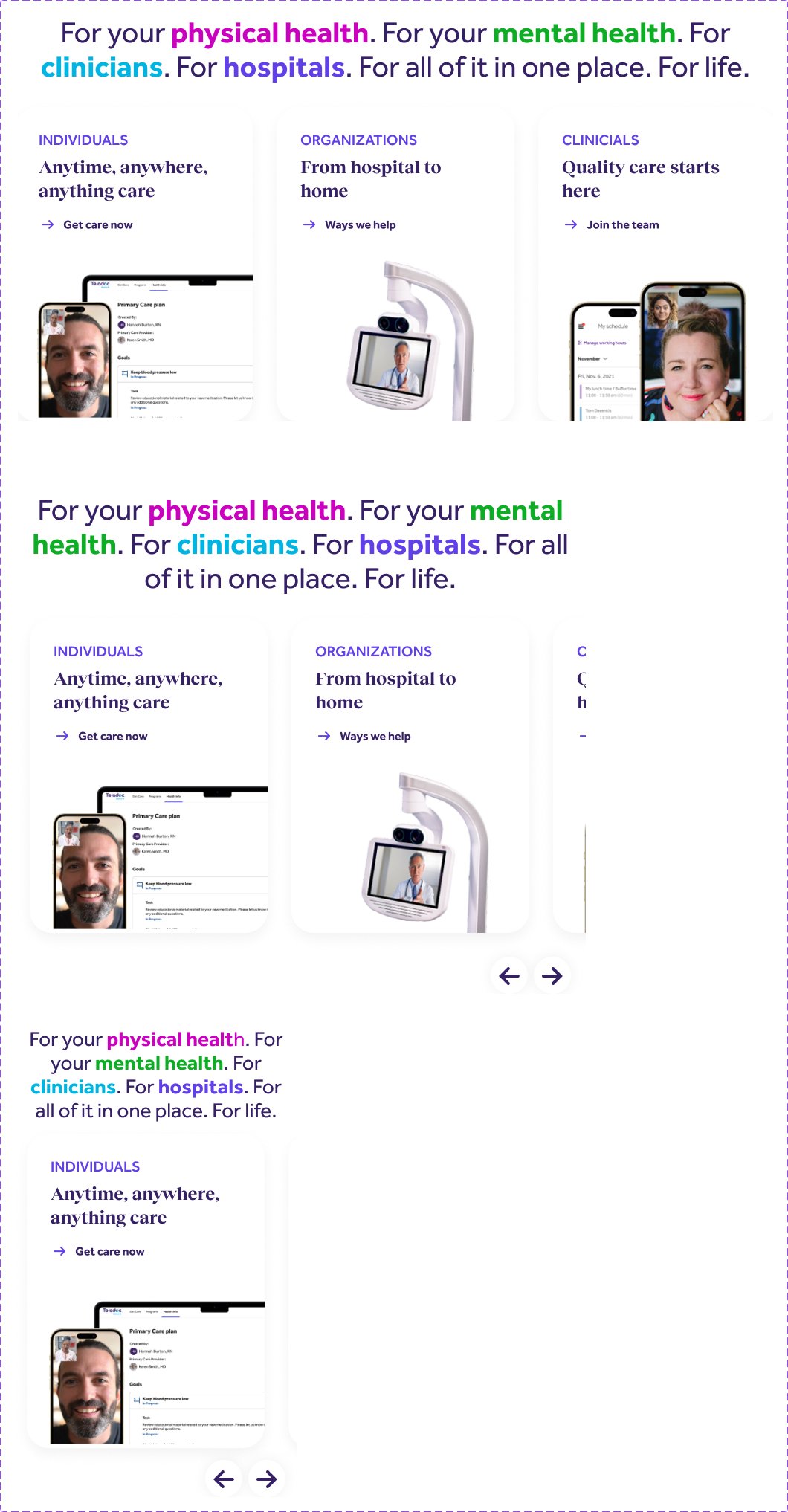
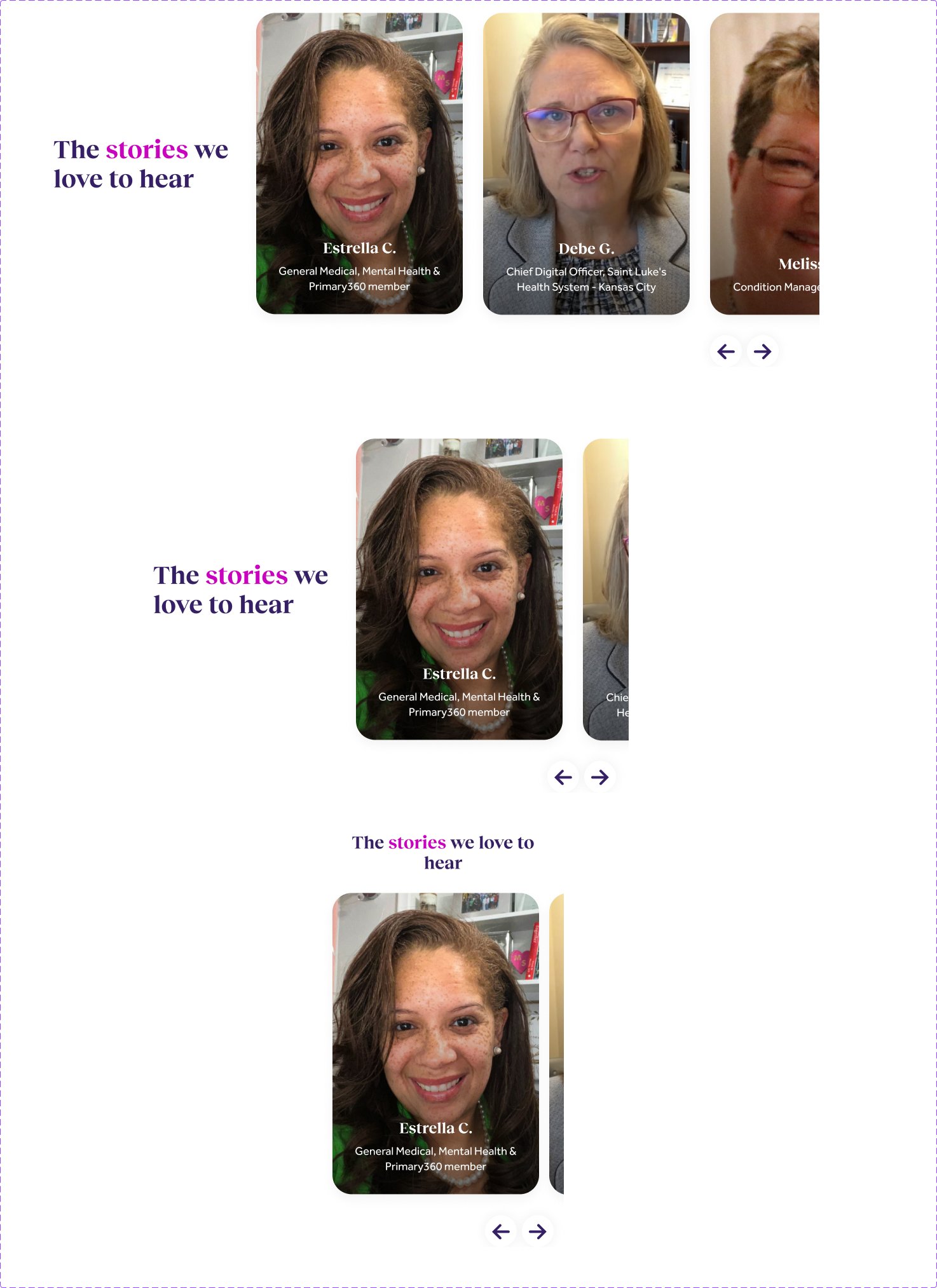
Component library, page two — testimonial cards and carousels
Component library, page two — testimonial cards & carousels
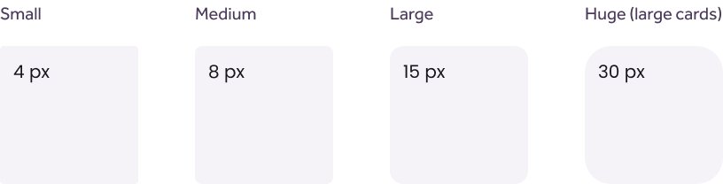
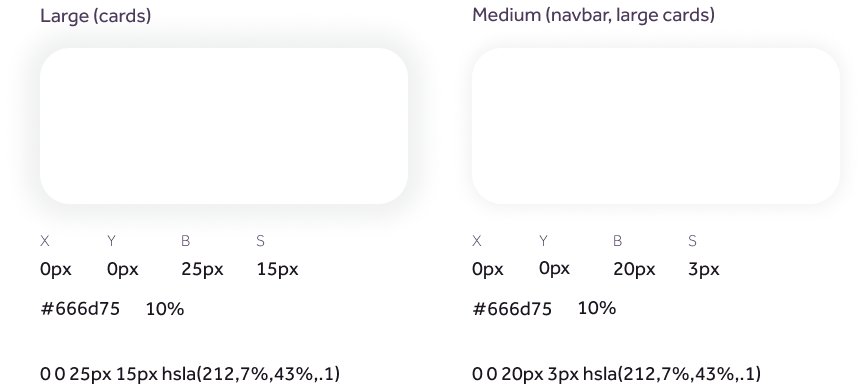
Corner-radius tokens — small, medium, large and huge Shadow tokens for cards, large and medium elevation Spacing scale from 2px to 64px
Radius, shadow & spacing tokens
Next project

Corporate Re-Brand →