
The onboarding journey new Citi cardmembers land on straight from the QR code on their mailer — where they activate their card, set up their online account, add it to their wallet, and form their first real impression of the brand. Built across Strata Elite, Strata, AAdvantage, and Custom Cash.
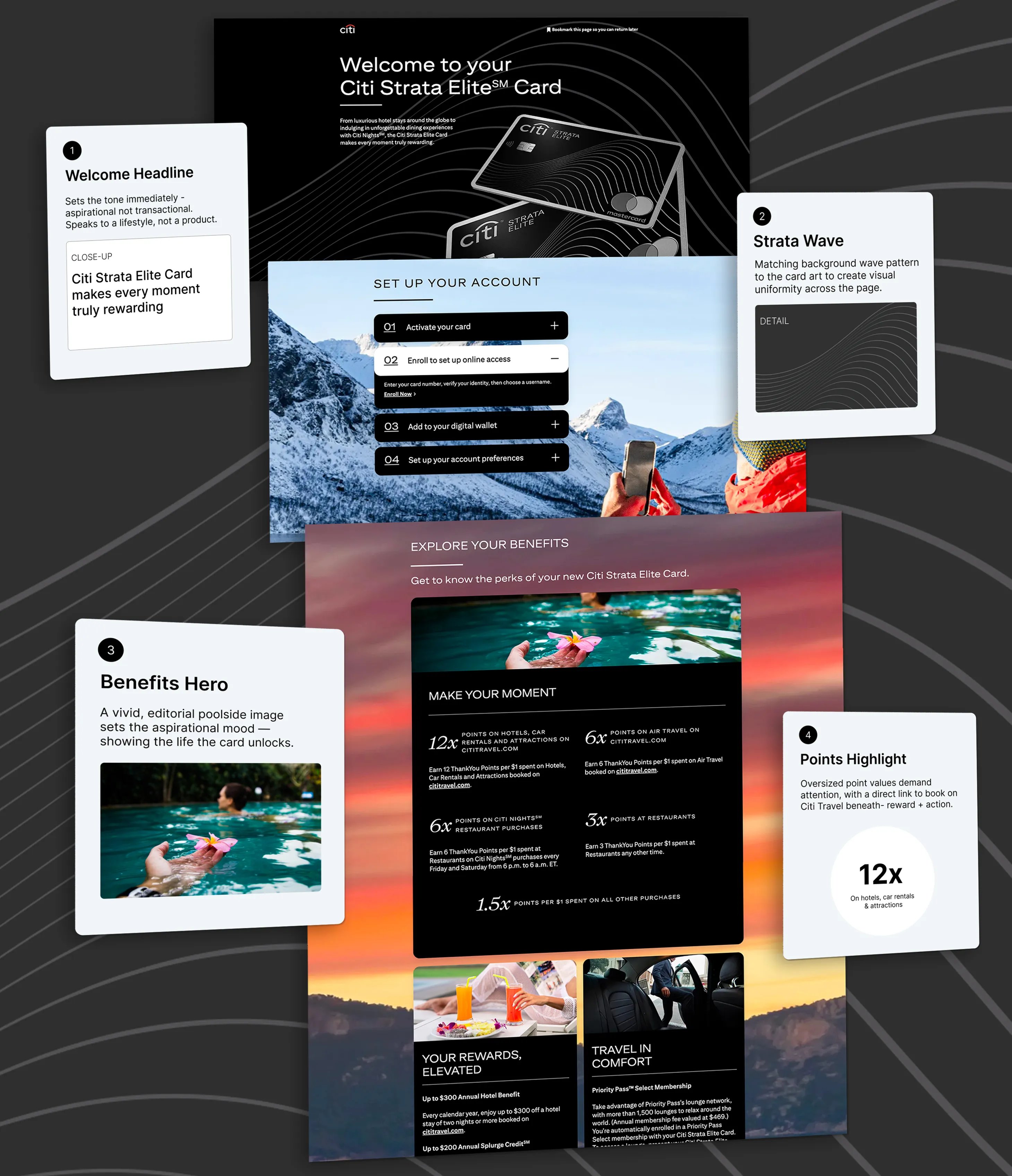
A new cardmember's first digital touchpoint with Citi isn't an app or a statement — it's a QR code on the mailer that arrives with their physical card. Scanning it drops them into the Digital Welcome Kit (DWK): activate the card, set up online access, add it to a digital wallet, and customize account preferences, all in one sitting.
That makes the DWK disproportionately important relative to its size. It's where a brand-new customer forms their first real impression of the product they just chose — and the difference between a clean, confident onboarding and a clunky one shows up directly in activation and account setup rates, long before anyone touches customer service.
Rather than one generic onboarding template, I led my team in designing a DWK system that holds a consistent structure — welcome, activation steps, benefits exploration — while flexing its art direction, photography, and tone to match each product's own brand position, from Strata Elite's premium travel aesthetic to Custom Cash's simpler, everyday-rewards voice.
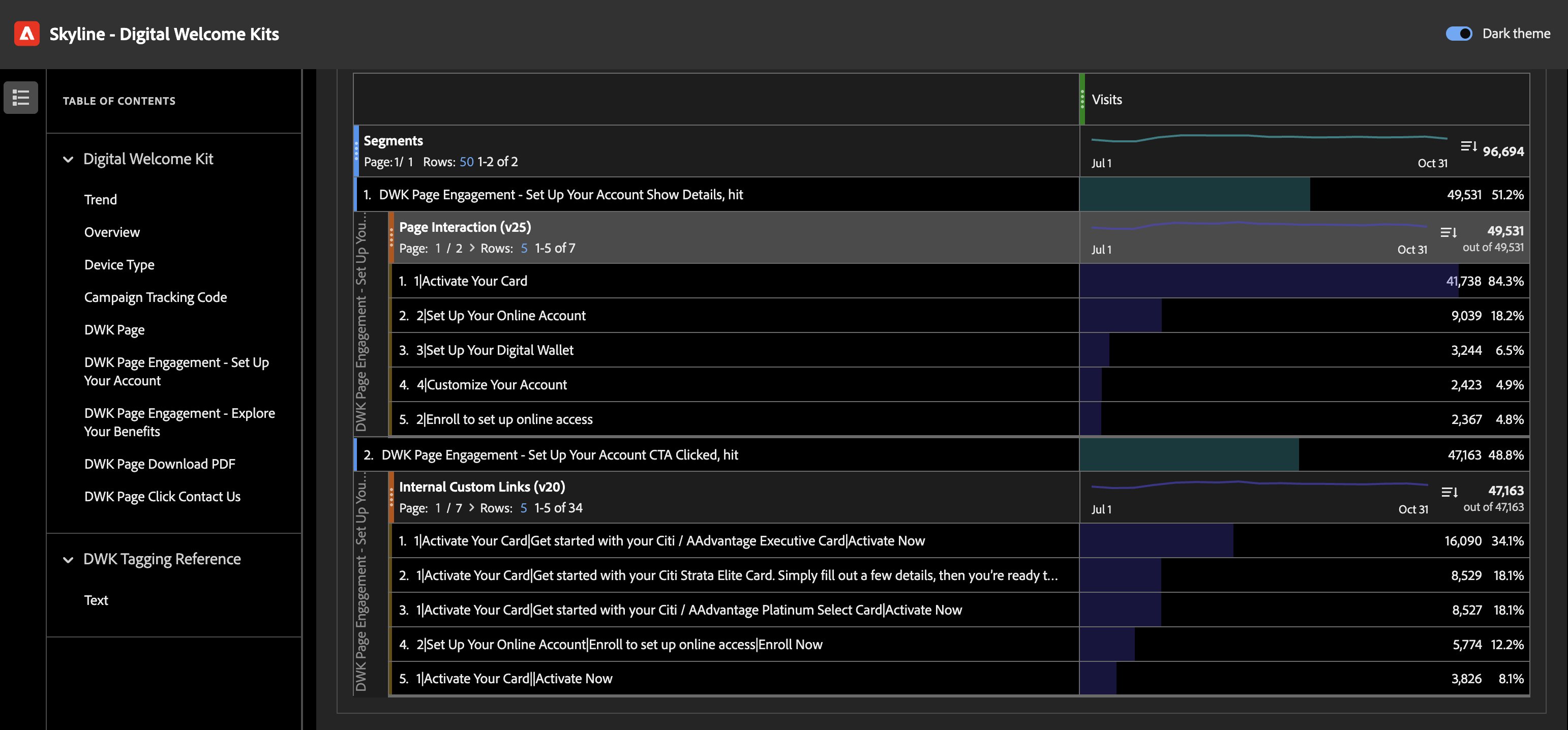
An analyst on my team built me a custom Adobe Analytics dashboard for the DWK, which let me guide the team with real behavioral data instead of guesswork — where cardmembers dropped off in the account-setup flow, and which card products' links they engaged with most inside the "Activate Your Card" step.
total DWK visits in the measured period, across all card products
of visitors engaged with the "Set Up Your Account" flow at all
drop-off across the four setup steps — activate, enroll online, add to wallet, customize
That step-by-step drop-off — 84.3% activating their card, falling to 18.2% completing online enrollment, 6.5% adding a digital wallet, and 4.9% customizing preferences — told us plainly where cardmembers were giving up. It's the reason the setup flow is framed as four short, individually-completable steps rather than one long form: each step needed to stand on its own and feel worth finishing, since most people wouldn't make it to the last one in a single visit.
Strata Elite & Strata
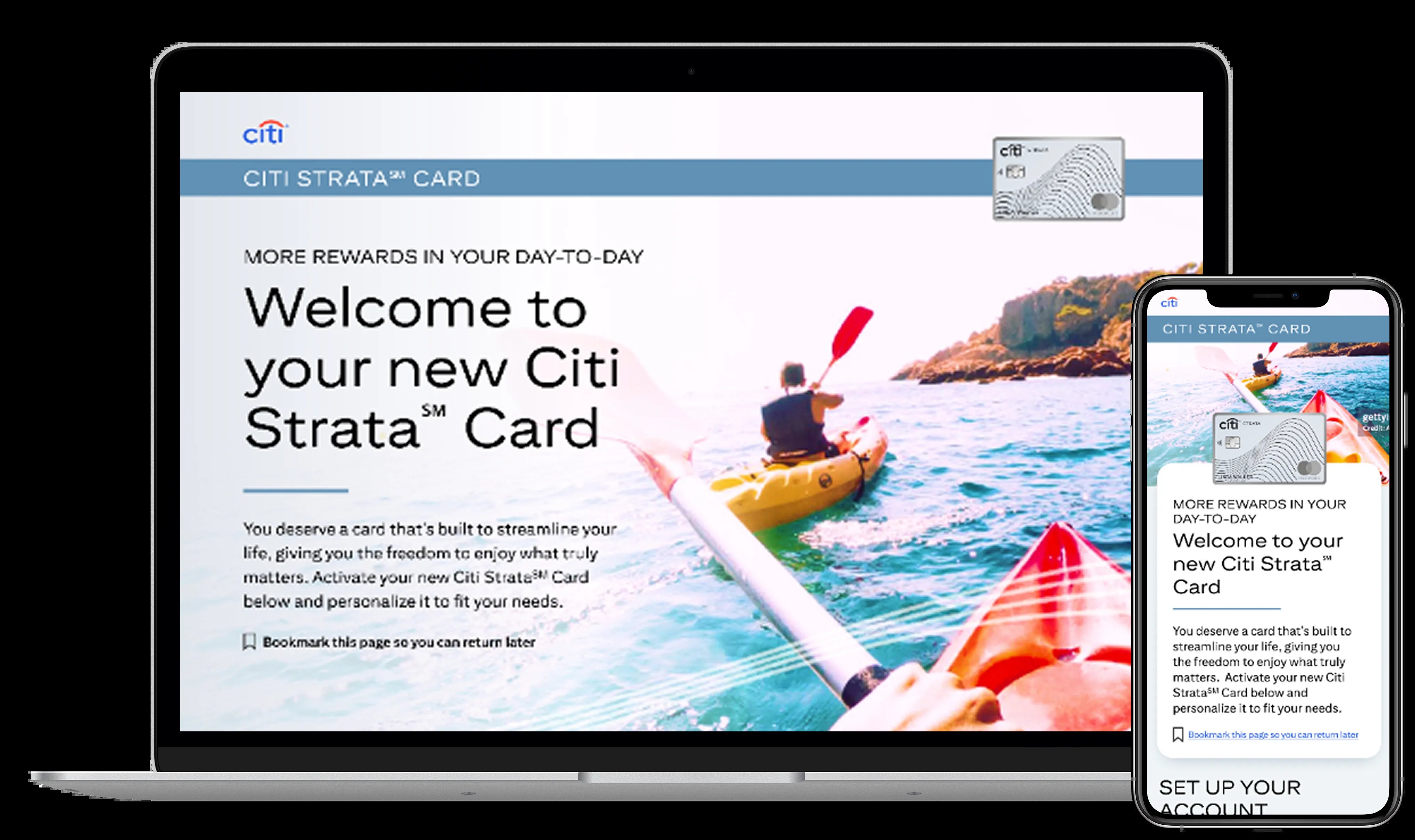
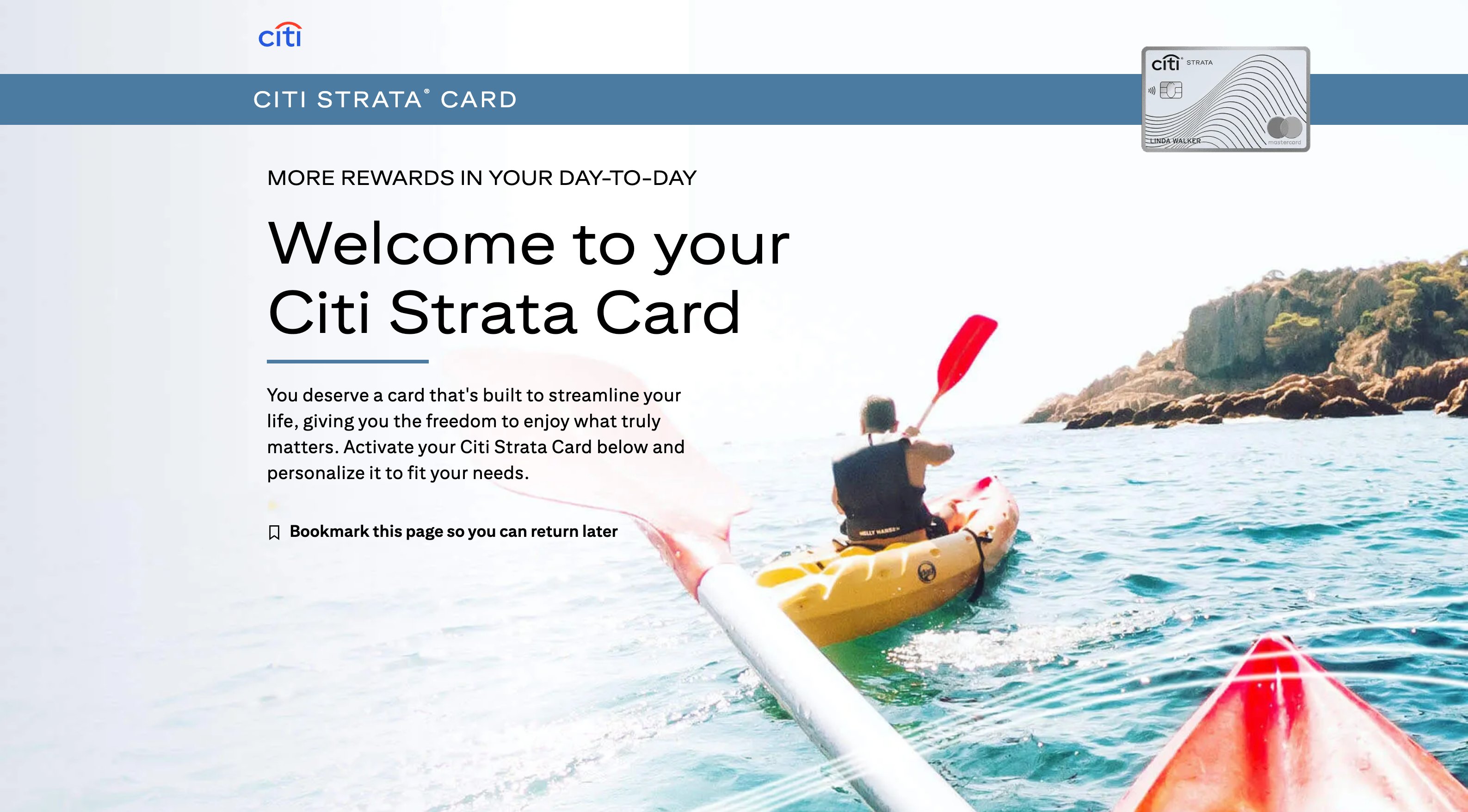
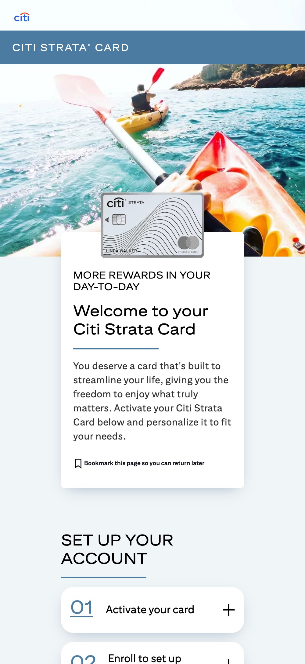
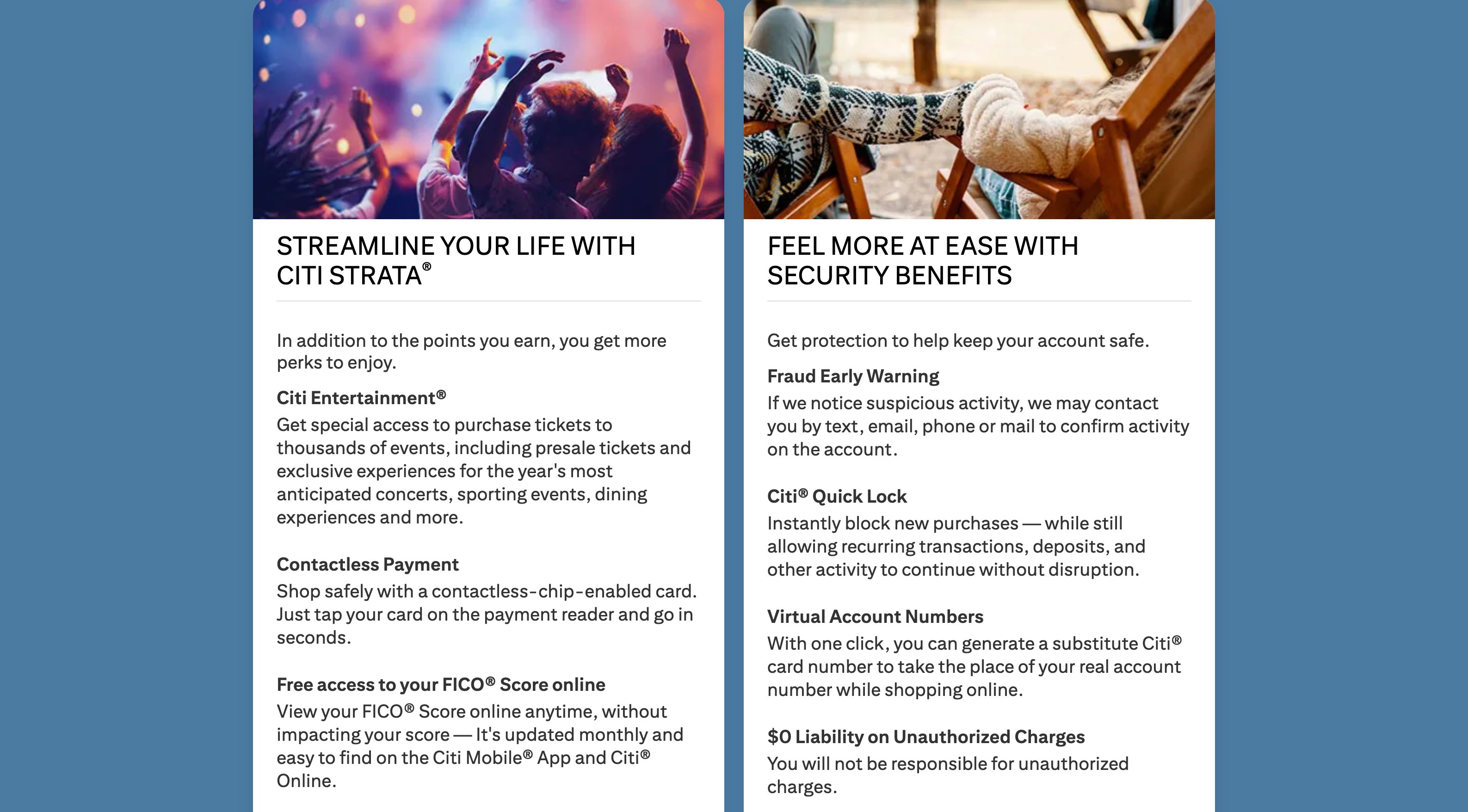
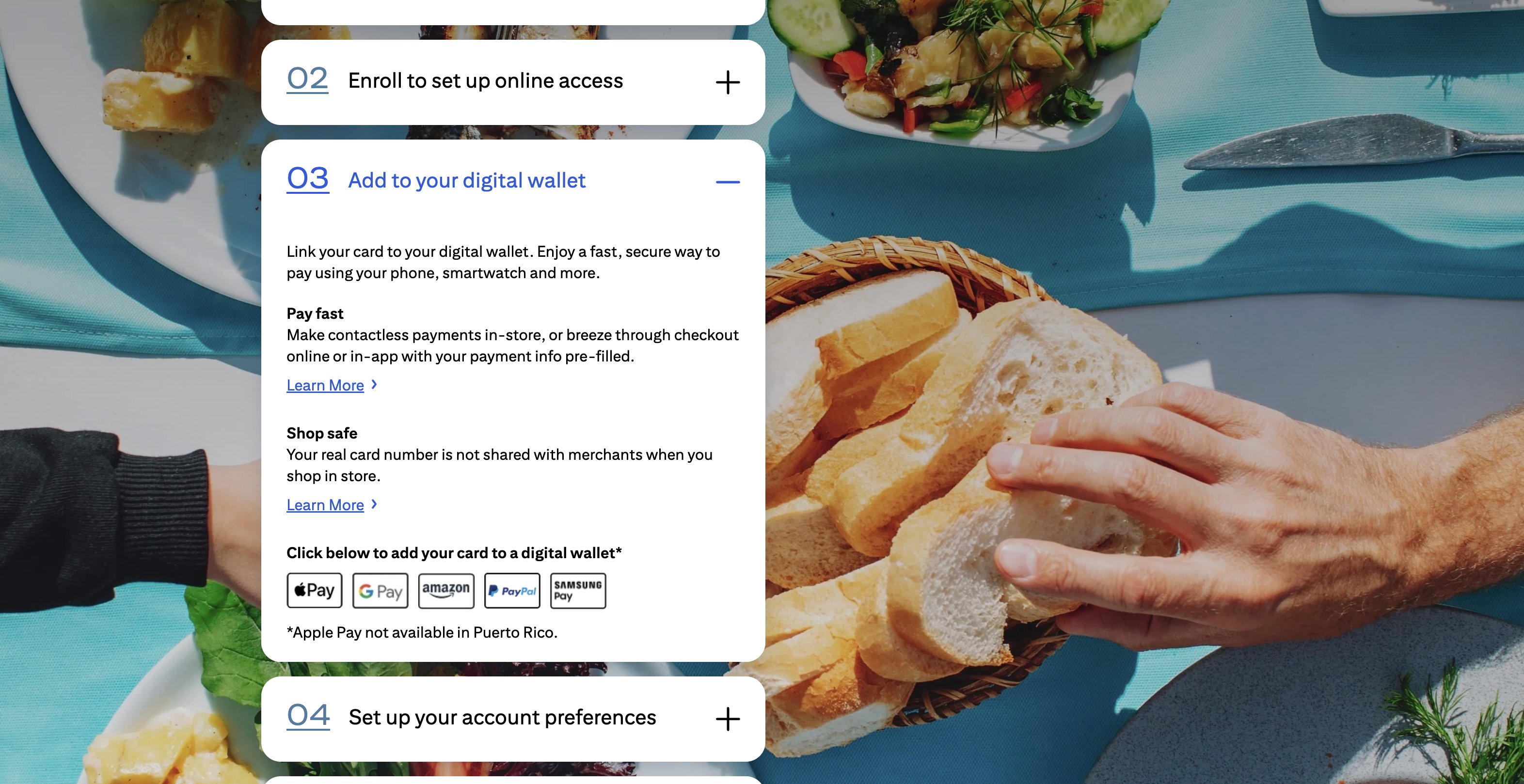
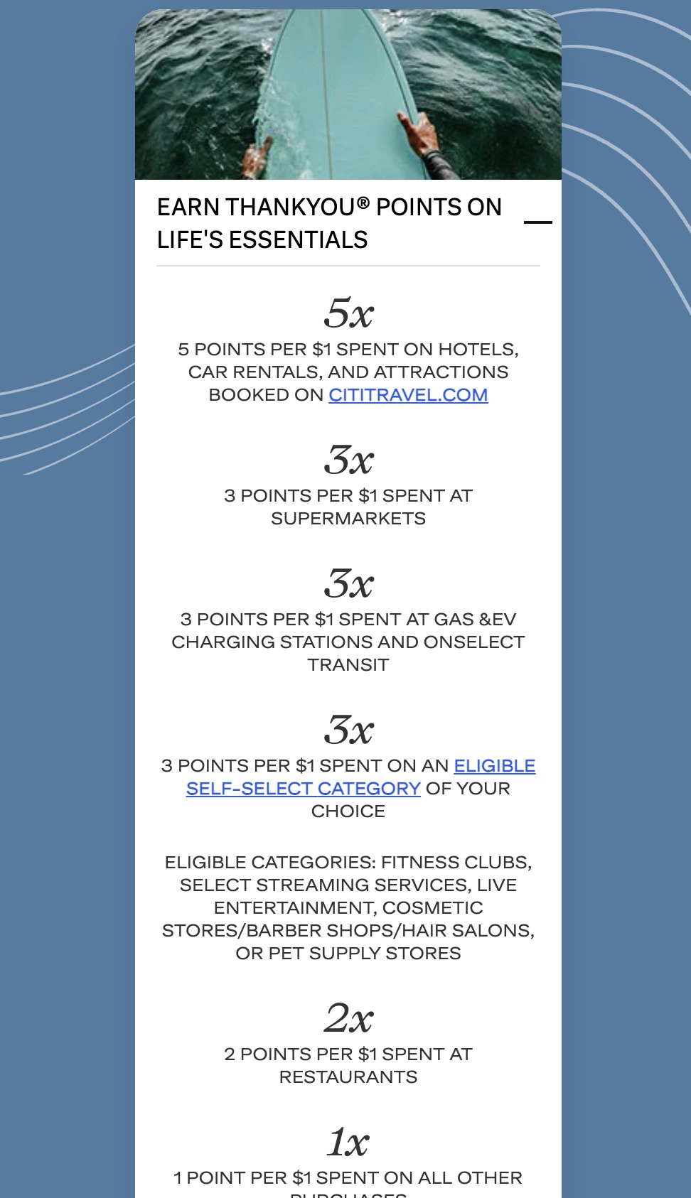
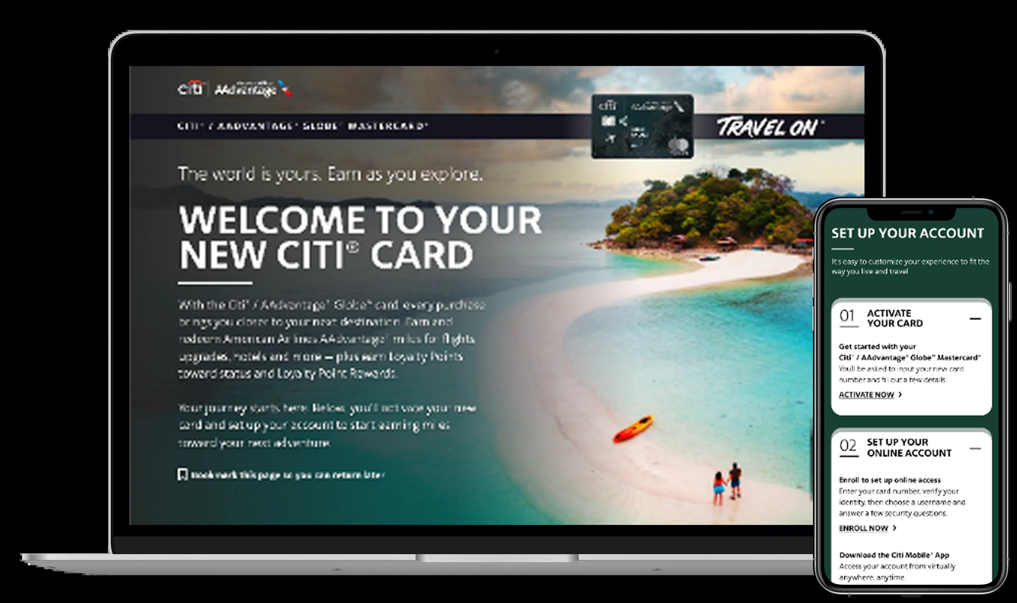
The same system extends to the Citi / AAdvantage co-brand cards — the dashboard above showed AAdvantage Executive and AAdvantage Platinum Select among the most-clicked card links inside the activation step, alongside Strata Elite, so the kit's design had to hold up across all three brands at once.
Custom Cash
Custom Cash is a no-annual-fee, everyday-rewards card, so its Digital Welcome Kit trades Strata's aspirational travel photography for a lighter, more approachable tone — same four-step account setup, same clarity on benefits, but calibrated to a cardmember who wants to get set up fast and start earning cash back, not plan a trip.
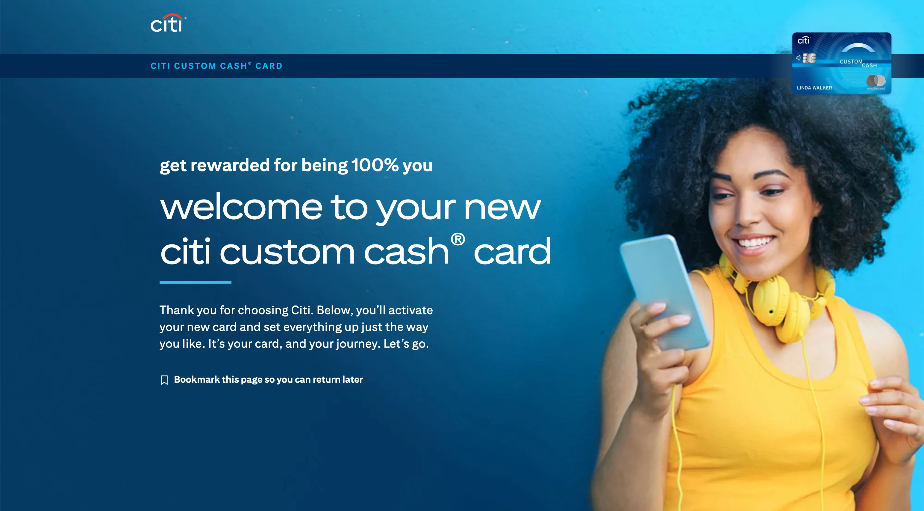
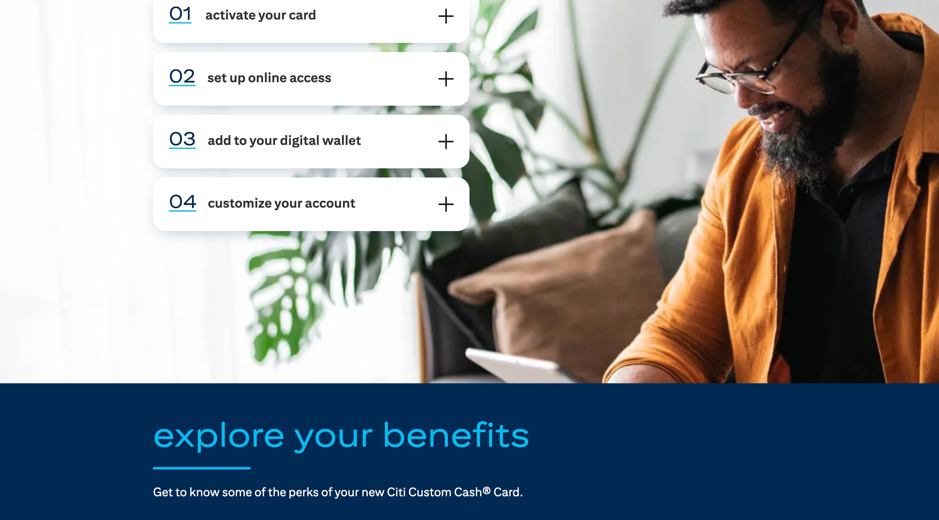
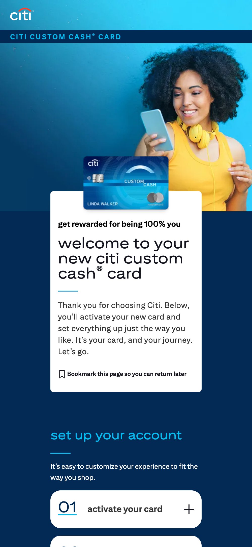
Across every product, the brief was the same: consumers get driven here straight from a mailer the moment their card arrives, so the UX has to make activation effortless while the brand still gets to make its best first impression. Getting both right, product after product, is what this case study is really about.