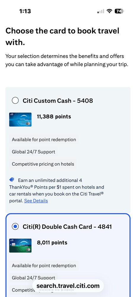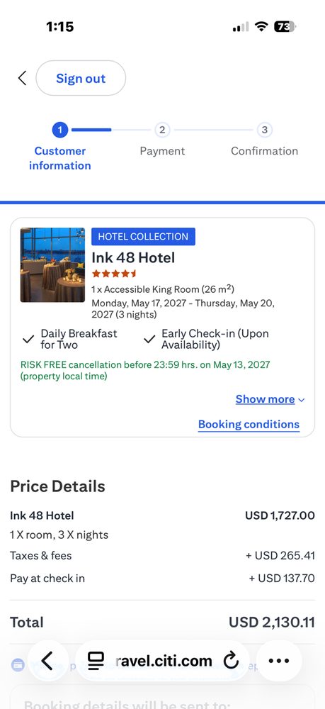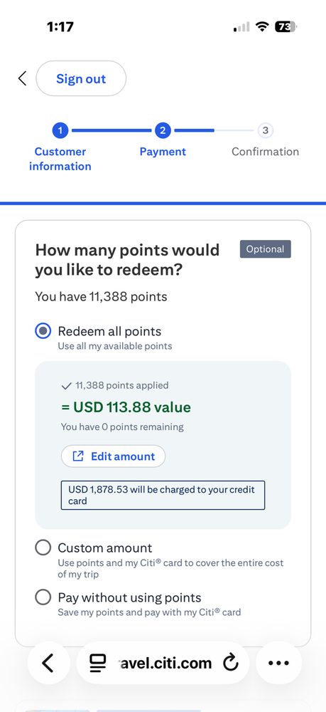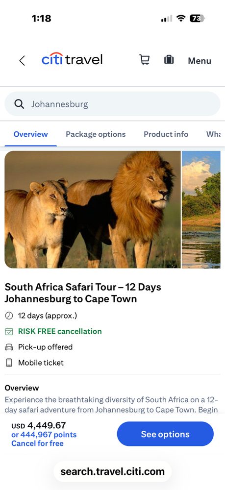
A ground-up UX modernization of Citi's travel booking platform — hotels, flights, cars, and attractions — built in partnership with product, marketing, multiple lines of business, and Agoda (formerly Rocket Travel), the platform's engineering vendor.
 ↑ New LTO placement
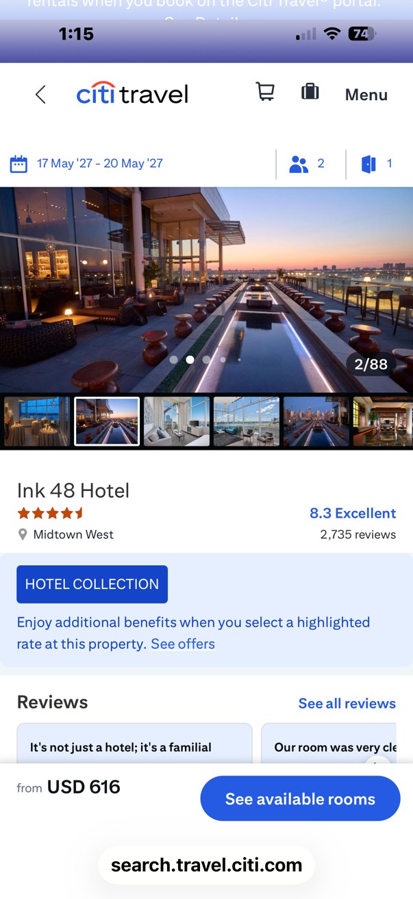 New: Hotel Collection
Citi Travel runs on a white-labeled platform built and maintained by an outside engineering vendor — Agoda, formerly Rocket Travel. That arrangement kept the lights on, but it meant the experience itself had drifted: merchandising, promotions, and cross-sell were buried well below the fold, the hierarchy across hotels, flights, cars, and attractions was inconsistent, and no one inside Citi owned the UX as a whole.
The business was also changing underneath the product — new card partnerships, new promotional mechanics, new cross-functional priorities from marketing and individual lines of business — faster than the platform's design was built to absorb.
I stepped in as the Creative Director accountable for the UX of Citi Travel end to end, working directly with product management, marketing, individual lines of business, and Agoda's engineering team to re-architect how the experience prioritizes information across the booking journey.
The highest-leverage change: repositioning limited-time offers (LTOs) and card-linked promotions directly beneath the search module — above the fold, before a single result loads — instead of buried in a secondary module further down the page. It's a small layout decision with an outsized effect on what a customer actually sees first.
Of everything tested, the new above-the-fold placement for limited-time offers drove a meaningful, sustained uptick in bookings from the moment it went live — the clearest signal yet that surfacing value earlier in the journey outperforms burying it.
Notable, sustained lift in booking conversion following the LTO repositioning — the top-performing test on the roadmap
core travel surfaces brought under one UX direction: hotels, flights, cars, attractions & tours
unified cross-functional effort — product, marketing, multiple lines of business, and the Agoda platform team
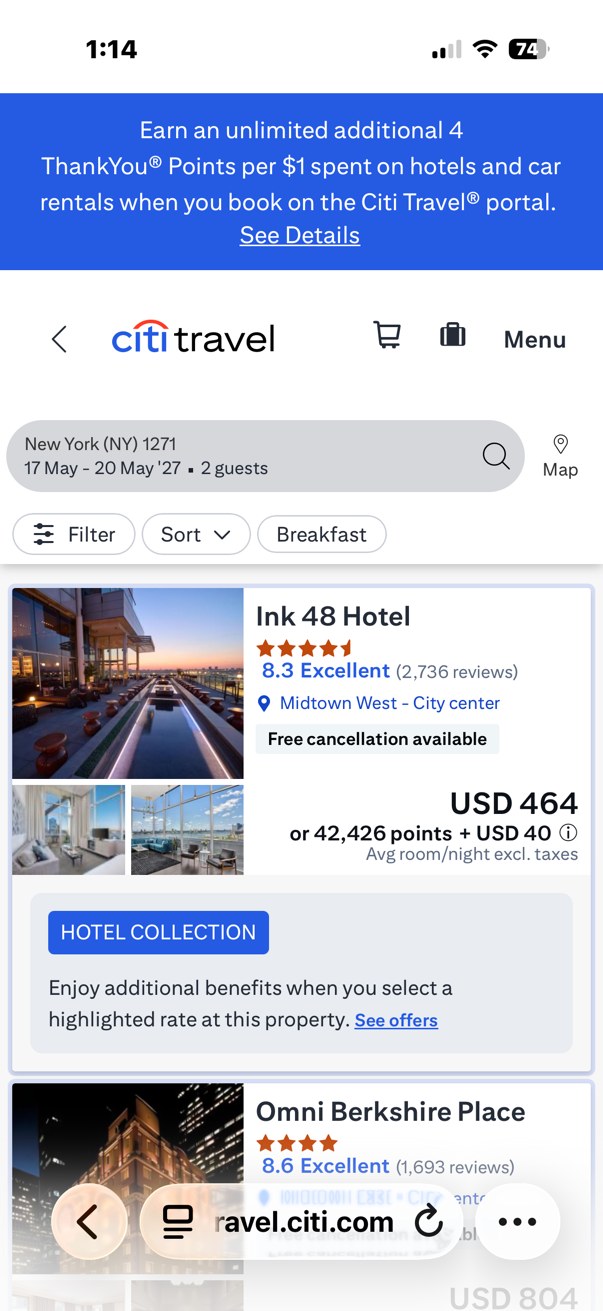
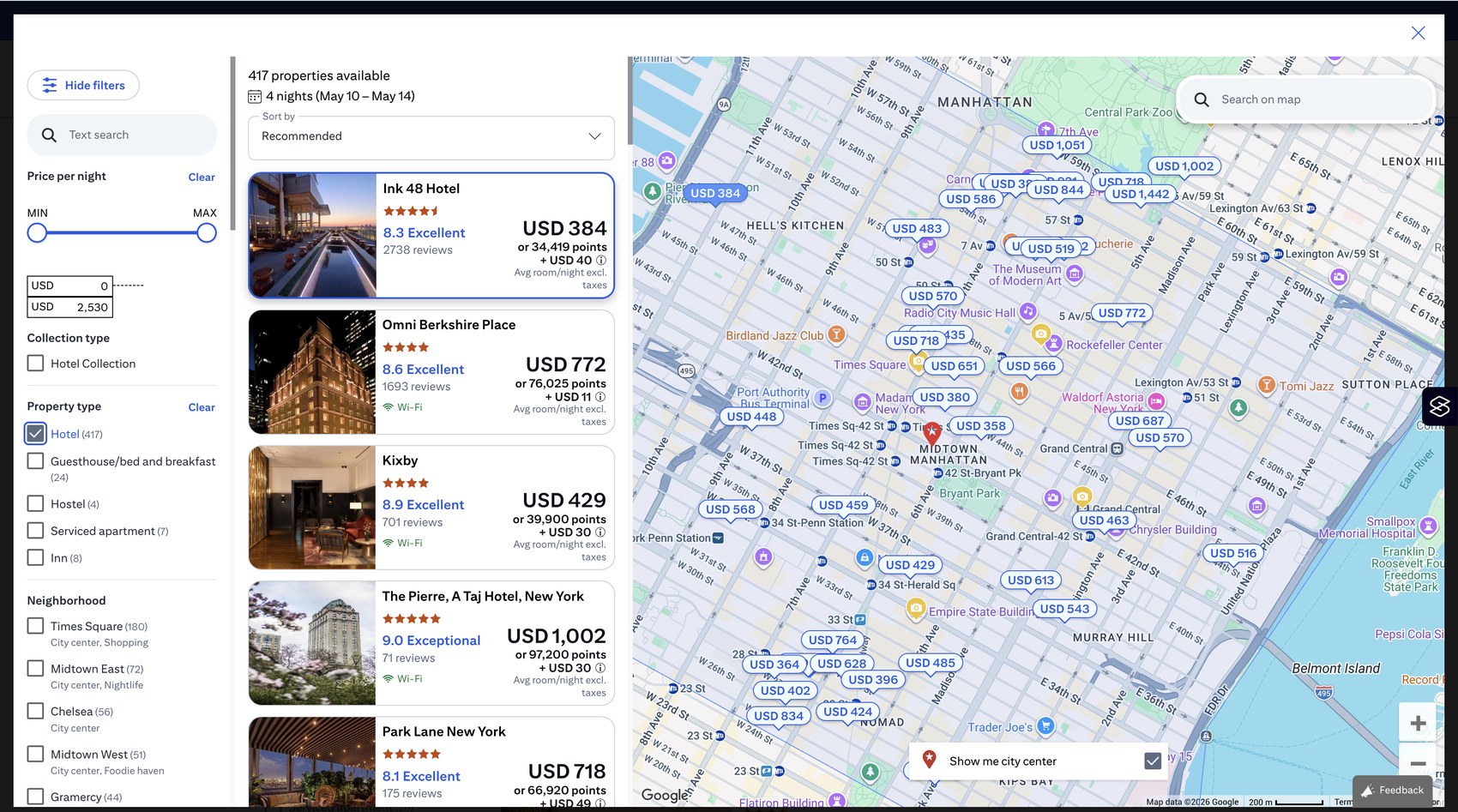
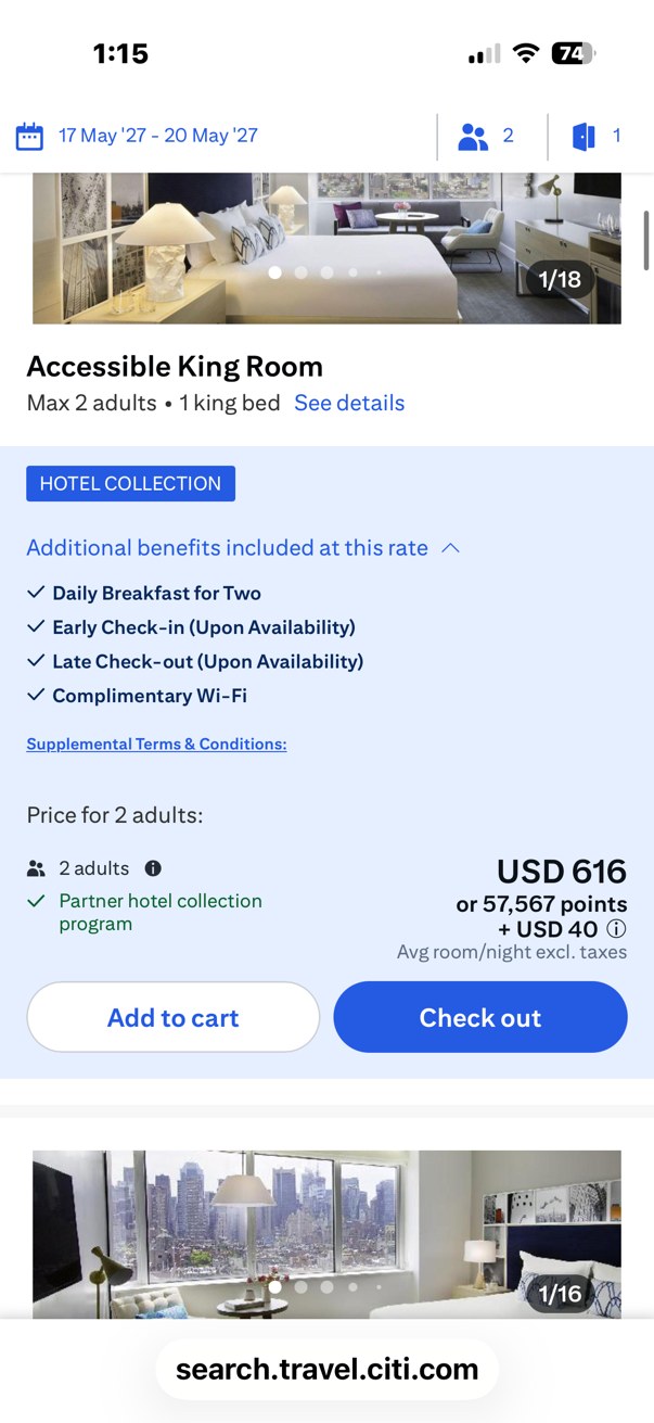
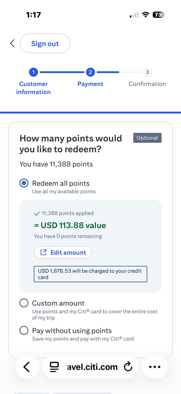
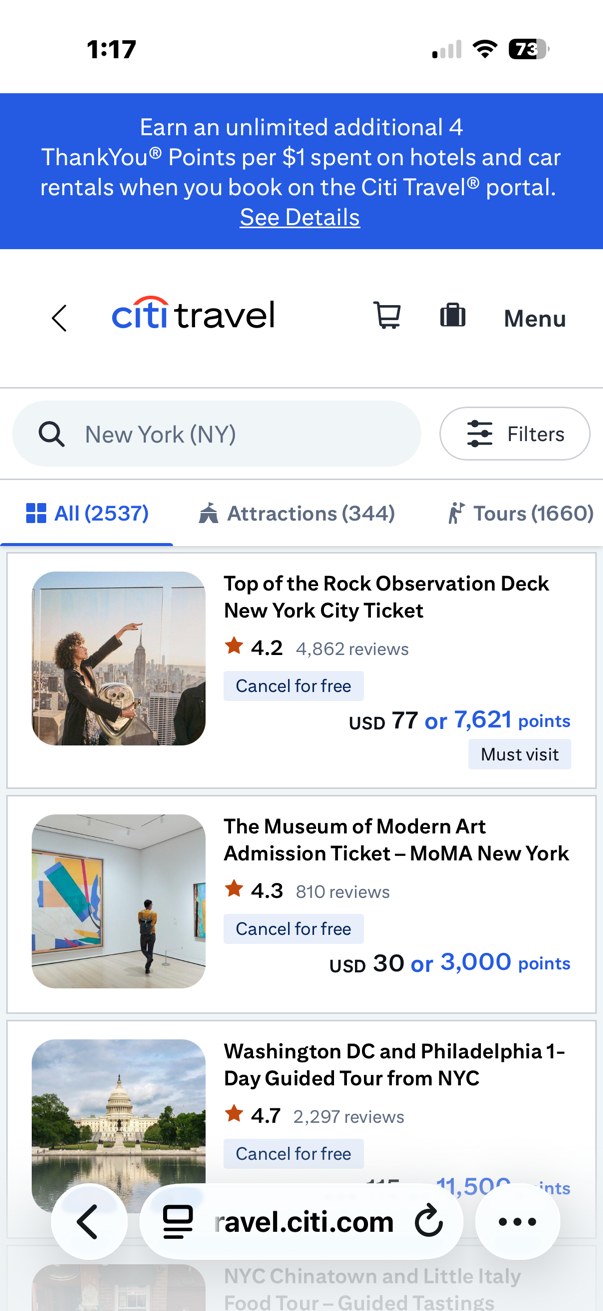
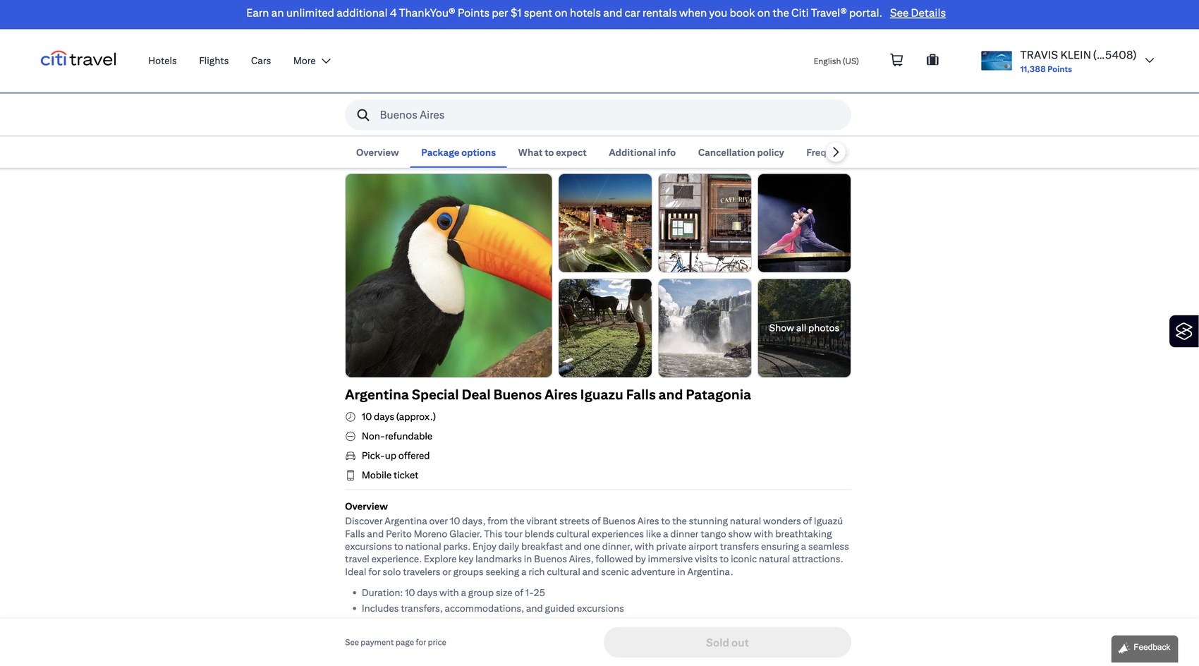
Citi Travel app — additional screens